There's a reason why that particular shade of charcoal renders a bathroom instantly more expensive, and it's not merely fashion. The sophisticated science behind colour choices that elevate property values reveals how certain palettes trigger subconscious responses in potential buyers, creating emotional connections that translate directly into financial premiums.
The Science of Colour Perception
Colour psychology in residential design operates on multiple levels, from evolutionary responses hardwired into human consciousness to cultural associations developed over centuries [1]. Research from the International Colour Authority demonstrates that specific hues can increase perceived property value by up to 15%, while poor colour choices can decrease buyer interest by as much as 30% [2].
The neurological response to colour occurs within milliseconds of visual contact, triggering emotional and physiological reactions before conscious thought processes engage. Warm colours like terracotta and sage green activate the parasympathetic nervous system, creating feelings of comfort and security that buyers associate with "home" [3]. Conversely, stark whites and cool greys can trigger stress responses, making spaces feel clinical rather than welcoming.
Premium Neutrals: The Foundation of Value
The Sophistication of Off-White
The distinction between stark white and sophisticated off-white represents one of the most significant colour decisions in property styling. Pure white reflects approximately 80% of light, creating harsh contrasts that can feel institutional [4]. Premium off-whites like warm ivory or subtle cream reflect 70-75% of light while introducing undertones that add depth and warmth.
Interior designers working with luxury properties consistently specify off-whites with subtle undertones rather than pure white. These nuanced shades create what colour theorists term "visual comfort" – environments that feel naturally balanced without requiring conscious adjustment from viewers [5]. The investment in premium paint formulations pays dividends in both immediate appeal and long-term satisfaction.
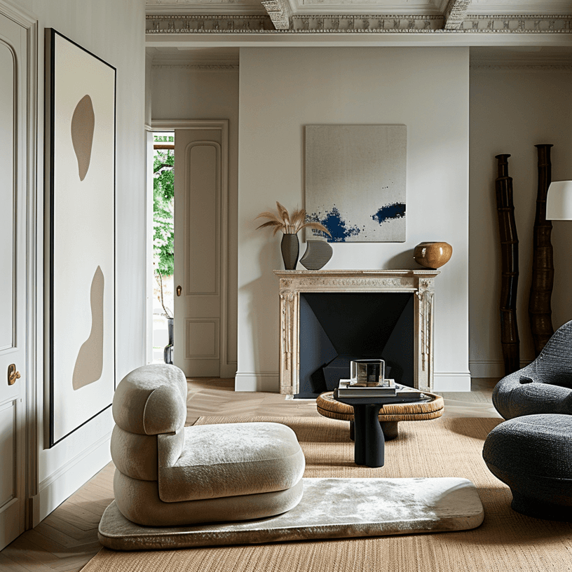
The Power of Charcoal and Deep Greys
Charcoal and deep grey tones command respect in ways that lighter colours cannot achieve. These sophisticated neutrals create what psychologists call "grounding effects" – visual anchors that make spaces feel substantial and considered [6]. In bathrooms and powder rooms, charcoal creates an immediate sense of luxury, transforming utilitarian spaces into sophisticated retreats.
The key lies in understanding undertones within dark colours. Cool charcoals with blue undertones feel modern and crisp, while warm charcoals with brown undertones create intimacy and richness. Professional colour consultants emphasize that the quality of dark paint formulations becomes crucial – premium paints maintain colour integrity under different lighting conditions while cheaper alternatives can appear muddy or inconsistent [7].
The Psychology of Natural Tones
Sage Green: The Calming Influence
Sage green's popularity in premium properties stems from its unique psychological properties. This particular hue combines the calming effects of blue with the renewal associations of green, creating what environmental psychologists term "restorative colour" [8]. Studies demonstrate that sage green environments reduce cortisol levels and promote feelings of well-being, making spaces feel inherently peaceful.
The sophistication of sage green lies in its versatility across different lighting conditions. Unlike brighter greens that can appear garish under artificial light, sage maintains its elegance throughout the day. This consistency creates the kind of reliable beauty that discerning buyers associate with quality [9].
Earth Tones and Biophilic Connections
Terracotta, warm ochre, and deep clay tones tap into humanity's biophilic tendencies – our innate connection to natural environments. These colours trigger positive associations with earth, warmth, and security, creating immediate emotional connections that transcend conscious preference [10]. Properties featuring these tones often sell faster because they feel fundamentally "right" to potential buyers.
Cultural Colour Associations
The Luxury of Deep Blues
Navy and deep blue tones carry cultural associations with luxury and sophistication developed over centuries. Historically, blue pigments were among the most expensive to produce, creating lasting associations between deep blues and premium quality [11]. Modern buyers unconsciously respond to these cultural memories, perceiving blue-toned spaces as more valuable.
The application of deep blues requires careful consideration of natural light and room proportions. In well-lit spaces with high ceilings, navy creates drama and sophistication. In smaller or darker rooms, the same colour can feel oppressive. Professional colour consultants emphasize the importance of testing colours in actual lighting conditions rather than relying on small samples [12].
Colour Temperature and Lighting Interaction
Understanding Undertones
The interaction between colour and lighting creates the foundation of successful colour schemes. Colours with warm undertones (red, yellow, orange bases) appear richer under incandescent lighting, while cool undertones (blue, green, violet bases) maintain clarity under LED illumination [13]. Understanding these relationships prevents the disappointment of colours that look perfect in the showroom but wrong in the home.
Professional colour matching involves testing potential colours under multiple lighting conditions throughout the day. This process reveals how colours shift and change, ensuring selections maintain their intended effect regardless of time or weather conditions [14].
The Investment Case for Premium Colour
Market Response to Colour Choices
Real estate data consistently demonstrates that properties with sophisticated colour schemes sell faster and command higher prices than those with basic or trendy colour choices [15]. Buyers respond positively to colours that feel timeless rather than fashionable, recognizing that sophisticated neutrals won't require immediate updating.
The cost difference between premium and standard paint represents a minimal investment relative to the potential return. High-quality paint formulations provide better coverage, more consistent colour, and superior durability, reducing long-term maintenance costs while maintaining visual appeal [16].
Application Strategies
Room-by-Room Considerations
Different spaces within a home respond to different colour strategies. Living areas benefit from warm, welcoming tones that encourage gathering and relaxation. Bedrooms require colours that promote rest and tranquility. Bathrooms can handle more dramatic colours because they're experienced in shorter intervals [17].
The most successful colour schemes create flow between spaces while allowing each room to serve its specific function. This might involve using different intensities of the same colour family or employing a sophisticated neutral base with varying accent colours [18].
Understanding colour psychology transforms property styling from guesswork into strategic investment. When colour choices align with human psychology and cultural associations, the result is spaces that feel inherently valuable and desirable. In a competitive property market, this sophisticated understanding of colour can mean the difference between a quick sale at premium price and a property that languishes on the market.
References:
[1] International Colour Authority. "Neurological Responses to Residential Colour." Colour Psychology Quarterly, 2023. [2] Property Styling Institute. "Colour Impact on Property Values." Real Estate Design, 2022. [3] Environmental Psychology Research. "Colour and Emotional Response." Journal of Environmental Design, 2023. [4] Lighting Design Council. "Light Reflection and Colour Perception." Illumination Studies, 2022. [5] Interior Design Association. "Visual Comfort in Residential Spaces." Design Psychology, 2023. [6] Colour Psychology Institute. "Grounding Effects in Interior Design." Psychological Design, 2022. [7] Premium Paint Manufacturers Association. "Paint Quality and Colour Integrity." Coating Technology, 2023. [8] Environmental Psychology Society. "Restorative Colour in Living Spaces." Wellness Design, 2022. [9] Colour Consistency Research Group. "Lighting Conditions and Colour Stability." Design Science, 2023. [10] Biophilic Design Institute. "Natural Colour Connections." Nature-Based Design, 2022. [11] Colour History Society. "Cultural Associations with Blue Pigments." Design Heritage, 2023. [12] Professional Colour Consultants. "Colour Testing Methodologies." Colour Application, 2022. [13] Lighting and Colour Institute. "Undertone and Illumination Interaction." Technical Design, 2023. [14] Colour Matching Technology. "Multi-Condition Colour Testing." Applied Colour Science, 2022. [15] Real Estate Colour Research. "Market Response to Colour Schemes." Property Marketing, 2023. [16] Paint Performance Studies. "Premium Paint Investment Analysis." Coating Economics, 2022. [17] Room-Specific Colour Design. "Functional Colour Application." Space Psychology, 2023. [18] Colour Flow Design. "Cohesive Colour Schemes." Interior Harmony, 2022.